For Valheim players, this guide provides a blueprint for a simple but aestetic warehouse, let’s check it out.
Introduction
Hey,
I have build a warehouse for our new castle and since I thought it looks pretty, I decided to share it.
If something is unclear or you feel like there is room for improvement, just leave a short comment and I will make an update.
Blueprint and Screenshots
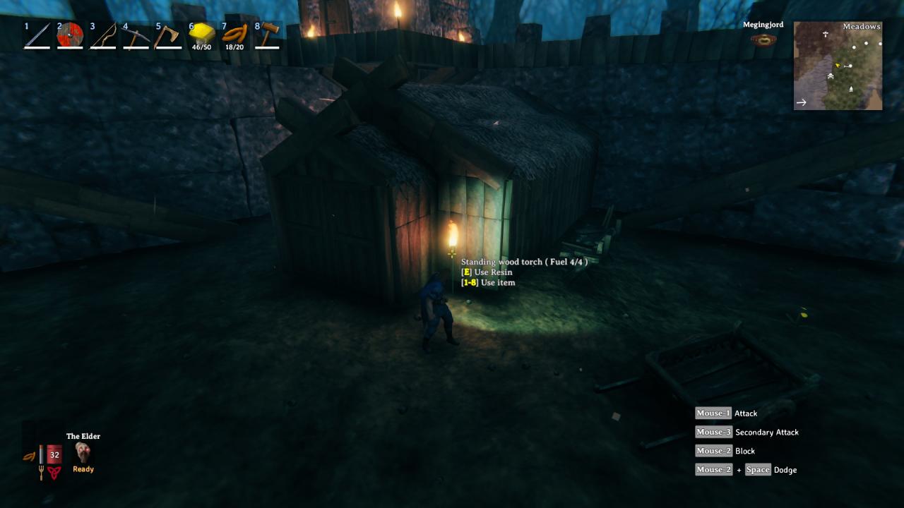
View from the outside
 View from the inside
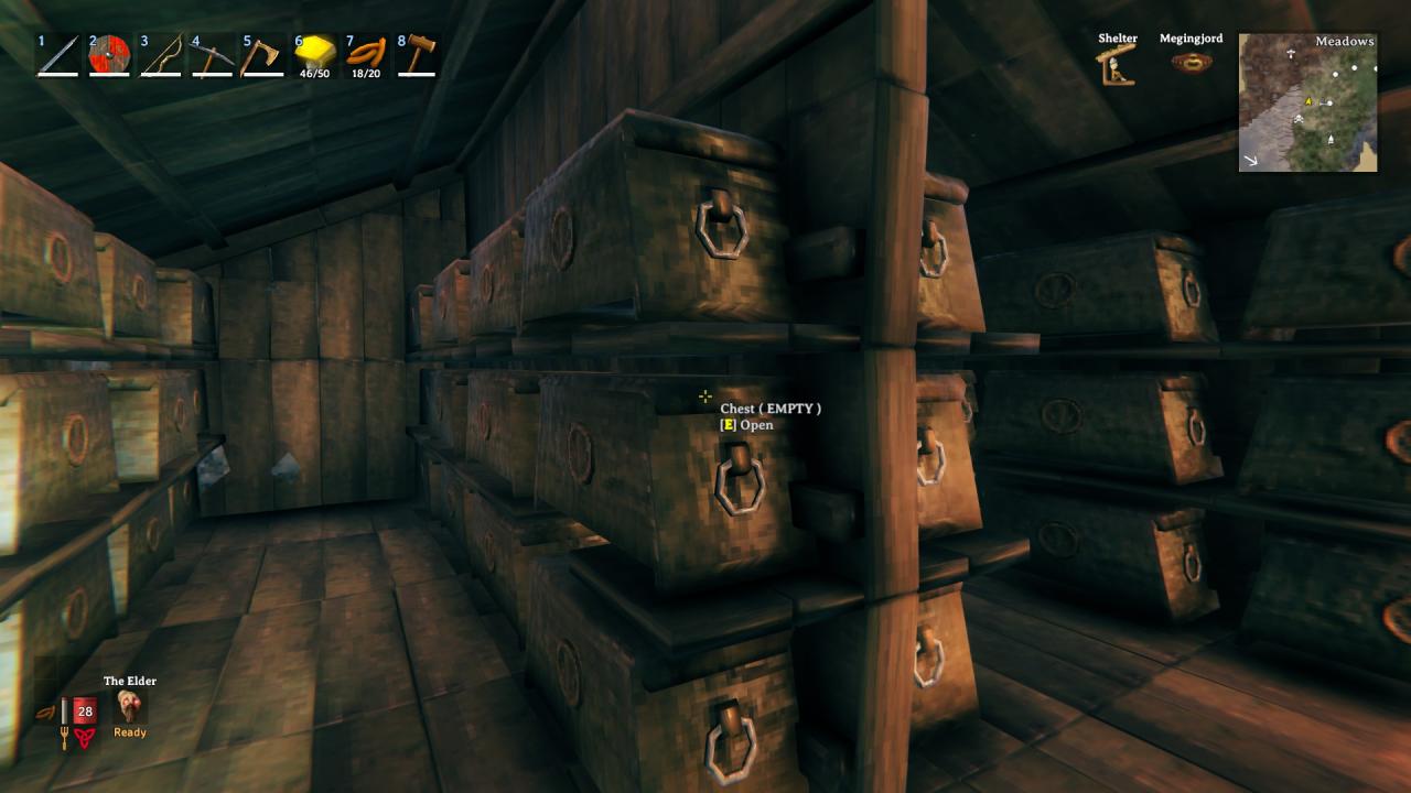
 View from the inside
Blueprint
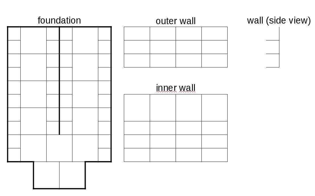 Foundation:
Thin lines = floor
Thick lines = wall
Notes
- you can extend the length of the wareouse depending on your needs. The shown one has space for 54 chests.
- This build only works with the normal chests. If you want to use the iron ones, you have to skip the middle row (if you want to keep the aestetics).
- If you feel like you need more chests on the same space, you can add a 4th row. I just didn’t like that because it seems to high up compared to the char size.
- in order to place the 3rd row, extend the second floor a little and step up.
- I have added extra space for the door, so that it doesn’t block your movement inside the warehouse.
That’s all we are sharing today in Valheim Building a Aestetic Warehouse Guide, if you have anything to add, please feel free to leave a comment below, and we’ll see you soon.
Credit to Judaspriester
Related Posts:
- Valheim FPS Fix Picture Guide
- Valheim How to Save and Load Your Constructions
- Valheim How to Flatten an Area in One Command
- Valheim Better Object Pickup Notification! [Mod]
- Valheim Simple Commands for FPS Boost

can you add the dimensions and required materials?